Welcome
We thank you for purchasing our product. Hope our product will be of great help for you to succeed. We appreciate your decision to read the manual before request for our support.
| Project | Mega Main Extensions |
| Created | 10 February 2015 at 12:00 GMT |
| Author | MegaMain |
| Author URI | megamain.com |
| Support | support.megamain.com |
Quick Start Guide
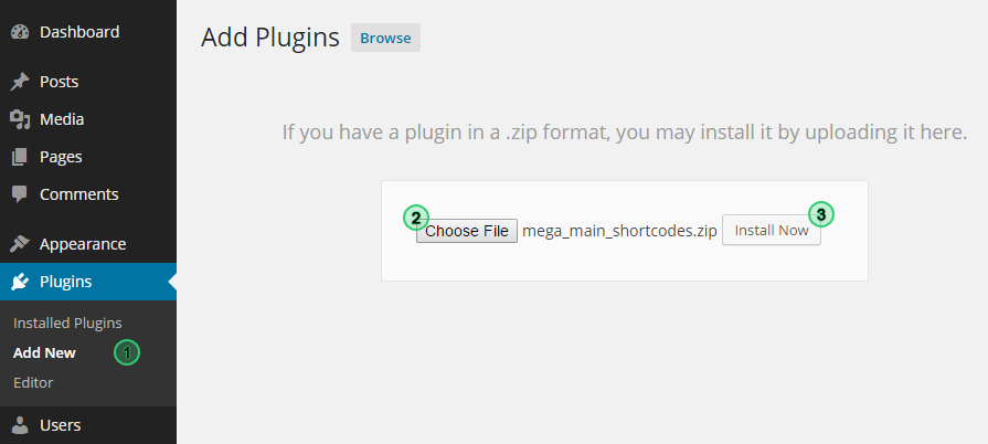
1) Instal
Dashboard ► Plugins ► Add New ► Upload
Follow the next steps to install plugin:
- Extract file "mega_main_extensions.zip" from the general archive to your computer;
- Log in dashboard of your WordPress;
- Next follow to the page "Plugins ► Add New ► Upload";
- In the file selection field you should choose "mega_main_extensions.zip" stored in your computer, and click the button "Install Now";
- Don't forget to activate plugin.
If you followed all instructions correctly, the link "Mega Main Extensions" should be added in the primary menu of the dashboard.
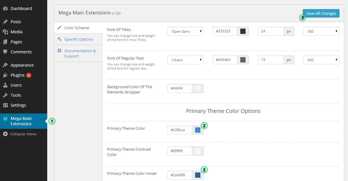
2) Configure the Plugin
Dashboard ► Mega Main Extensions
- Follow to the page "Dashboard ► Mega Main Extensions";
- (Optional) We recommend that configure the color scheme, which by default will apply to all elements of this plugin. Just choose primary color of the current theme;
- Click the button "Save All Changes".
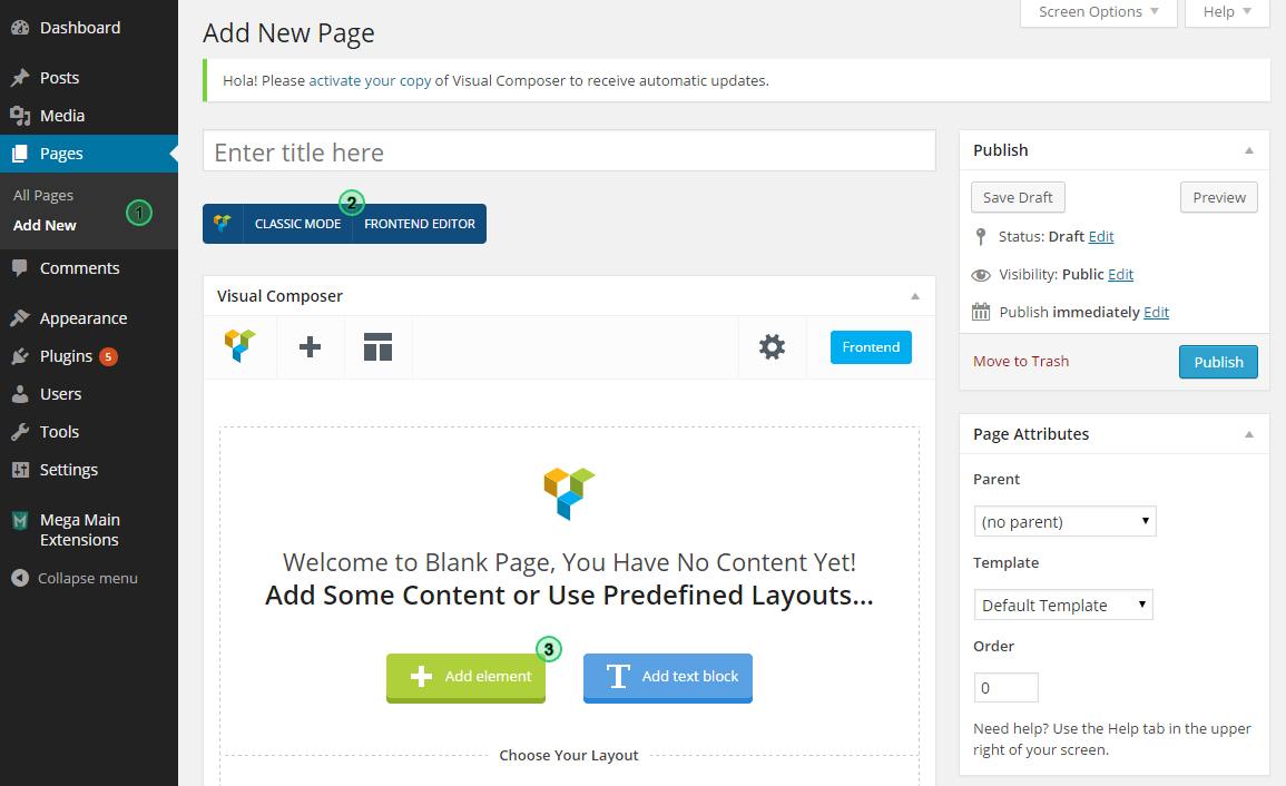
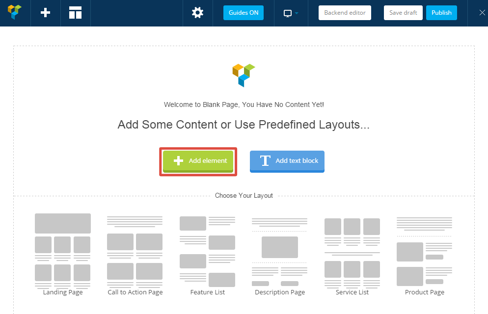
3) Ready to use "Mega Main Extensions" in the content of your site
Dashboard ► Pages ► Add New
- Go to the creating a new page (or edit old one);
- Select the element that you want to add into the content. You can use one of two ways:
- Visual Composer (require installed VC)
- Mega Main Lite Shortcodes Generator
Plugin Configuration
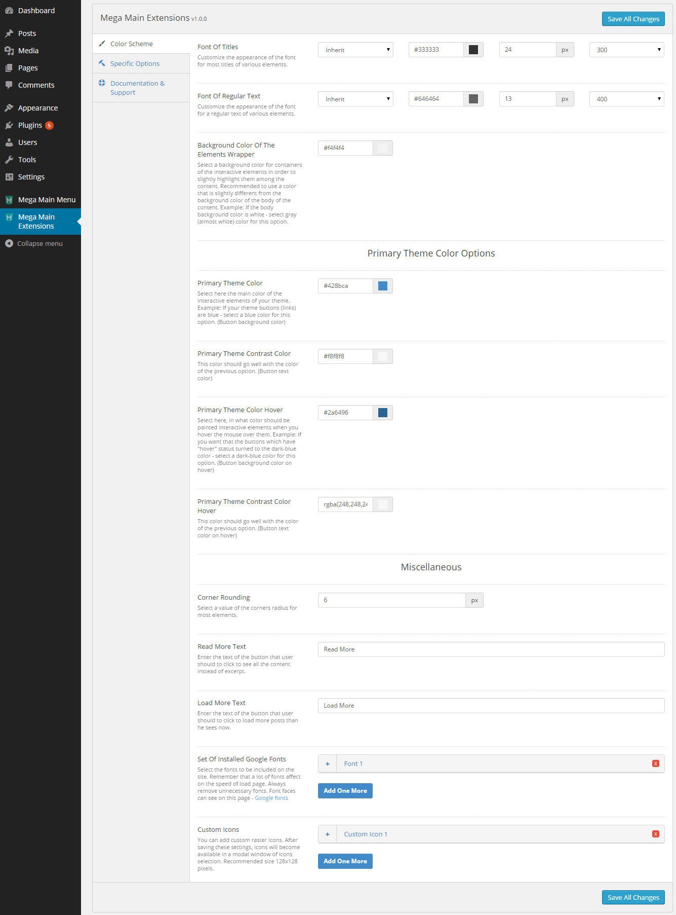
Color Scheme
Dashboard ► Mega Main Extensions ► Color Scheme
Font of Titles
Customize the appearance of the font for most titles of various elements.
Font of Regular Text
Customize the appearance of the font for a regular text of various elements.
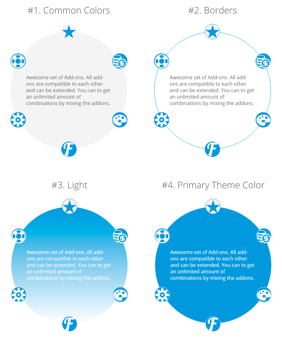
Background Color of the Elements Wrapper
Select a background color for containers of the interactive elements in order to slightly highlight them among the content. Recommended to use a color that is slightly different from the background color of the body of the content. Example: If the body background color is white - select gray (almost white) color for this option.
Primary Theme Color
Select here the main color of the interactive elements of your theme. Example: If your theme buttons (links) are blue - select a blue color for this option. (Button background color)
Primary Theme Contrast Color
This color should go well with the color of the previous option. (Button text color)
Secondary Theme Color (on Hover)
Select here, in what color should be painted interactive elements when you hover the mouse over them. Example: If you want that the buttons which have "hover" status turned to the dark-blue color - select a dark-blue color for this option. (Button background color on hover)
Secondary Theme Contrast Color (on Hover)
This color should go well with the color of the previous option. (Button text color on hover)
Corner Rounding
Select a value of the corners radius for most elements.
Read More Text
Enter the text of the button that user should to click to see all the content instead of excerpt.
Load More Text
Enter the text of the button that user should to click to load more posts than he sees now.
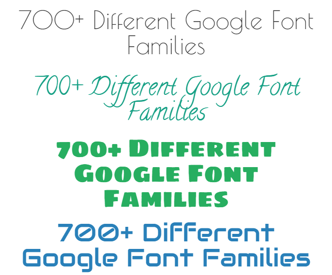
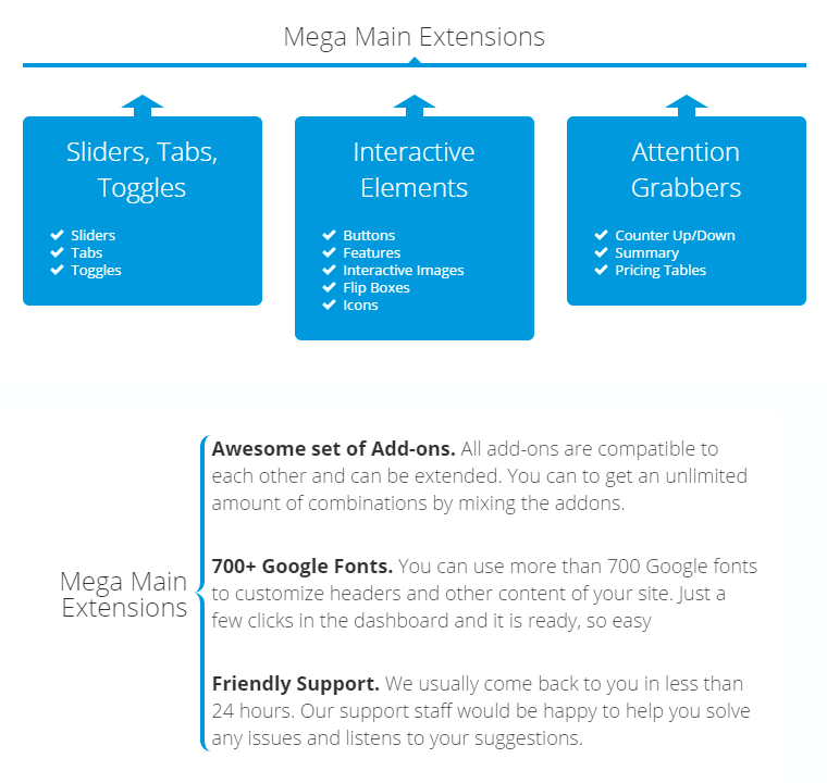
Set of Installed Google Fonts
Select the fonts to be included on the site. Remember that a lot of fonts affect on the speed of the page load. Always remove unnecessary fonts. Font faces can see on this page - Google fonts.
Custom Icons
You can add custom raster icons. After saving these settings, icons will become available in a modal window of icons selection. Recommended size 128x128 pixels.
Specific Options
Dashboard ► Mega Main Extensions ► Specific Options
Custom CSS
You can place here any necessary custom CSS properties.
Use sets of icons
Here you can activate different sets of icons. Remember that the larger the list of icons - require more of time to loading page.
Remove "wpautop" Filter
If you will use this option all automatic "paragraph" and "break line" symbols are will be removed from the content.
Use Coercive Styles
If this option is checked - all CSS properties for this plugin will be have "!important" priority.
Extensions (Shortcodes)
Dashboard ► Pages ► Edit Page
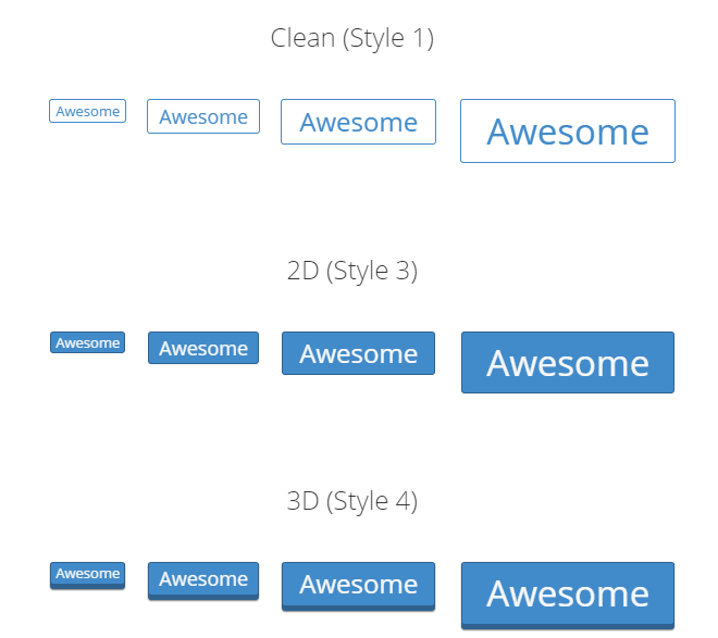
Button
Text
Enter the text of the button.
Style
Select the basic style of the element.
Size
Select size of the button.
Icon Before the Text
Icon that will displayed before the text. You can add more custom raster icons using the "Plugin Configuration Page". Leave blank to hide.
Icon After the Text
Icon that will displayed after the text. You can add more custom raster icons using the "Plugin Configuration Page". Leave blank to hide.
Link to
You can use this element as a link to some page.
Alignment
Specifies the horizontal alignment of element and it content.
Color Scheme
Select color scheme of this element. You can add more and edit color schemes using "Additional Styles" option on the configuration page of the plugin.
ShortCode:
[mme_button class="1" size="md" icon_before="im-icon-checkmark" link="https://megamain.com/" alignment="center" styles="predefined" animation="fadeInUp"]Lorem ipsum dolor...[/mme_button]
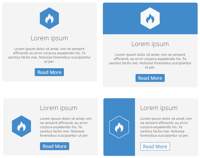
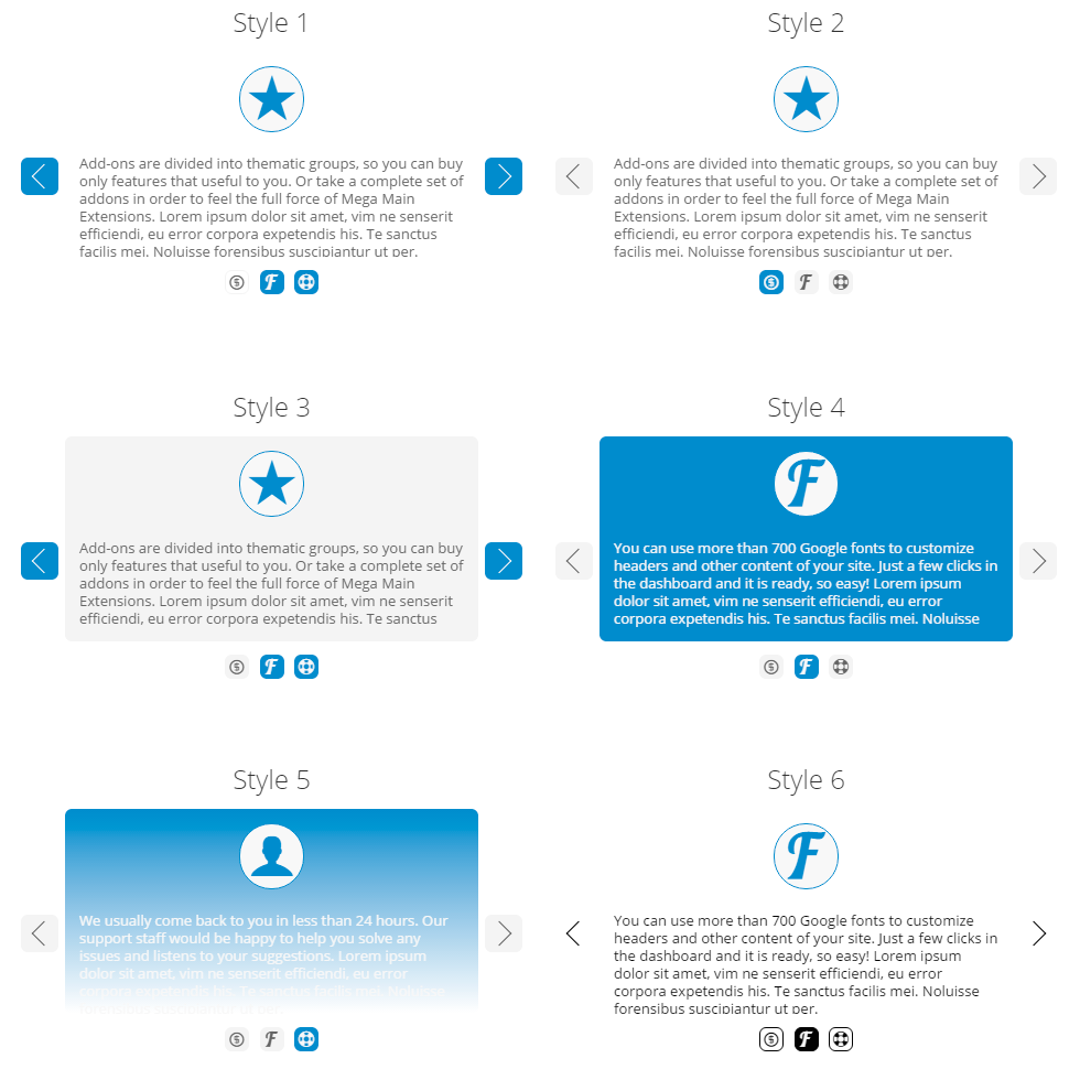
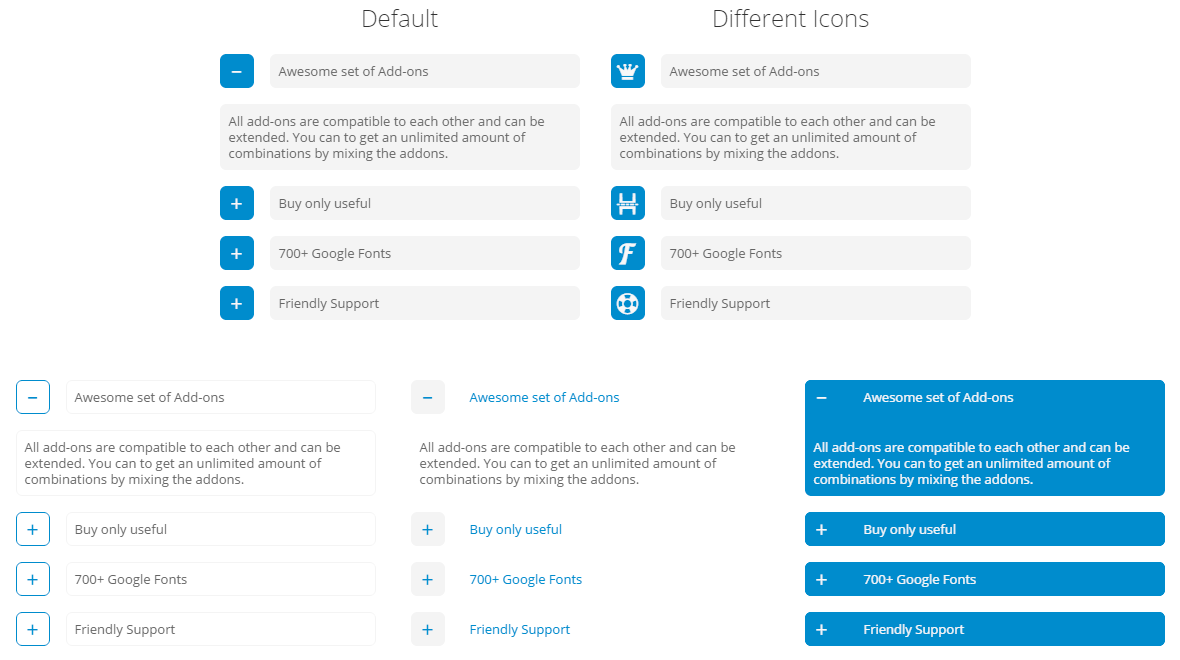
Feature
Style
Select the basic style of the element.
Alignment
Specifies the horizontal alignment of element and it content.
Form of the Icon Wrapper
You can select the form of wrapper around the icon.
Icon
You can add more custom raster icons using the "Plugin Configuration Page". Leave blank to hide.
Title
Enter the title of the feature. Leave blank to hide.
Text
Enter the text of the feature. Leave blank to hide.
Read More Text (Button)
Enter the text of the button.
Link Area
You can select the area of the feature that you want use as a link.
Link to
You can use this element as a link to some page.
Color Scheme
Select color scheme of this element. You can add more and edit color schemes using "Additional Styles" option on the configuration page of the plugin.
ShortCode:
[mme_feature class="1" alignment="left" icon="im-icon-checkmark" title="Lorem ipsum" readmore="Read More" link_area="readmore" link="https://megamain.com/" styles="predefined" icon_wrapper_form="cicle" animation="fadeInUp"]Lorem ipsum dolor...[/mme_feature]
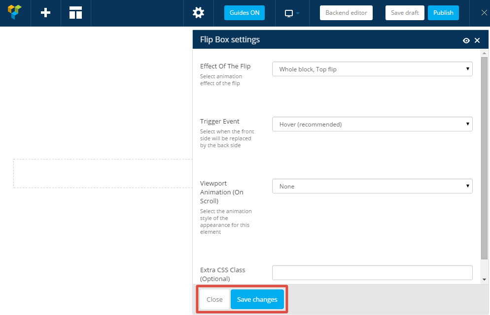
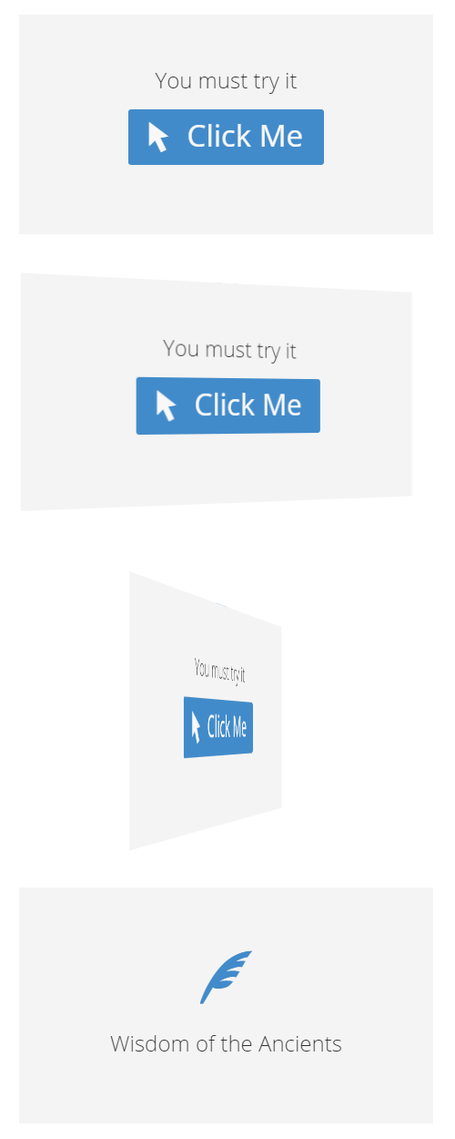
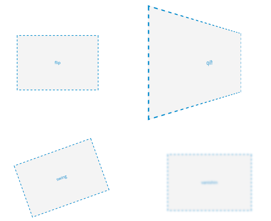
Flip Box
Effect of the Flip
Select animation effect of the flip.
Trigger Event
Select when the front side will be replaced by the back side.
Caution!
This shortcode must contain at least one other shortcode inside.
Instruction
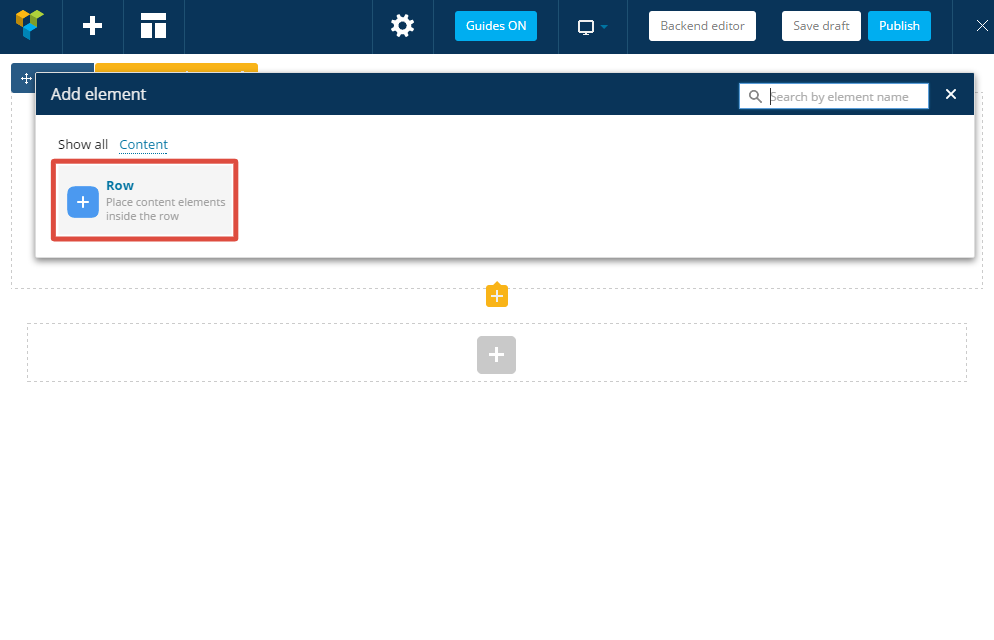
In order to create a box with content that changes when you hover the mouse - you have to go through the following steps:
- Go to page editing "Dashboard -> Pages -> Edit Page".
- Switch to the "FrontEnd Editor" mode.
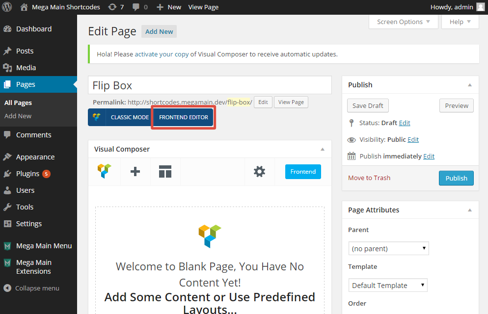
- Click to the "Add Element" button.
- Select the "Flip Box".

- You can change "Animation Effects" in the new modal window that called "Flip Box Settings" and click "Save changes" and then "Close" (modal window).
- Hover over the "Flip Box" section and click "Add Element" (plus icon).

- Select the "Row". It is your "Side A (Front)".
- Repeat previous two steps to add second "Row". It is your "Side B (Back)".
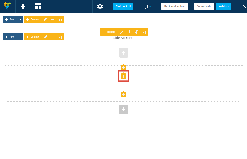
- Now you able to add any content (other shortcodes) in the "Front" and "Back" sides.
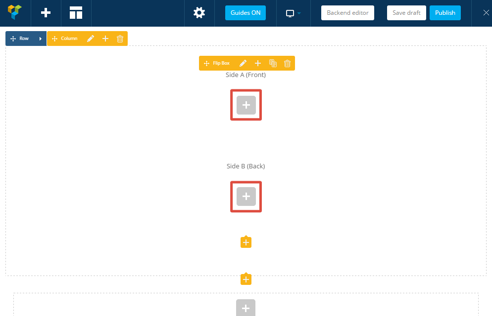
- Do not forget to save changes of the page! Done!

ShortCode:
[mme_flip_box flip_effect="whole_block_top" trigger="hover" animation="fadeInUp"] [vc_row] Any content of A side [/vc_row] [vc_row] Any content of B side [/vc_row][/mme_flip_box]
Icon
Style
Select the basic style of the element.
Size of the Icon
Select the icon size.
Icon
Select the icon that you want to use. You can add more custom raster icons using the "Plugin Configuration Page".
Link to
You can use this element as a link to some page.
Alignment
Specifies the horizontal alignment of element and it content.
Color Scheme
Select color scheme of this element. You can add more and edit color schemes using "Additional Styles" option on the configuration page of the plugin.
ShortCode:
[mme_icon class="1" size="20" icon="im-icon-checkmark" link="https://megamain.com/" alignment="center" styles="predefined" animation="fadeInUp"][/mme_icon]
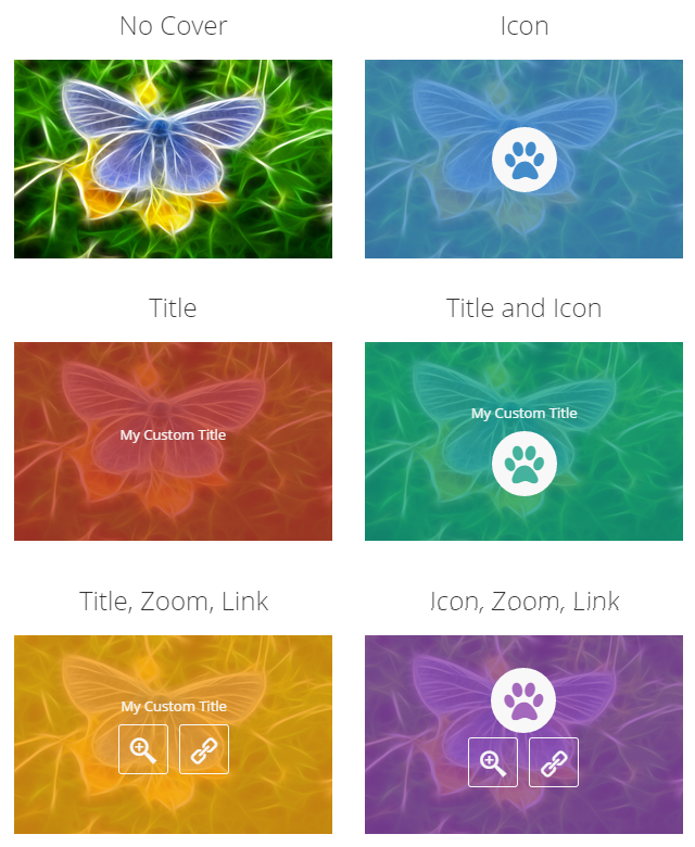
Image
Style
Select the basic style of the element.
Size
Select the size. In the percents, related to the parent container width.
Cover Elements
Title
Enter the title of the image.
Icon
Select the icon that you want to use. You can add more custom raster icons using the "Plugin Configuration Page".
Link to
You can use this element as a link to some page.
Alignment
Specifies the horizontal alignment of element and it content.
Color Scheme
Select color scheme of this element.
ShortCode:
[mme_image src="https://megamain.com/src/img/megamain-logo-120x120.png" class="1" size="100" cover="title icon" title="Lorem Ipsum" icon="im-icon-checkmark" link="https://megamain.com/" alignment="center" styles="predefined" animation="fadeInUp"][/mme_image]
Content Slider
Title of the slider (optional)
Specify the title (caption).
Navigation Direction (Arrows)
Select style and position of "Direction Navigation".
Navigation Pagination (Items)
Select style and position of "Pagination Navigation".
Color Scheme
Select color scheme of this element.
Animation Effect
Select animation effect of changing of tabs.
Animation Direction
Select direction of animation.
Slideshow
Select "Enable" to change tabs automatically.
Slideshow Speed
Specify the delay between changing of tabs.
Caution!
This shortcode must contain at least one "Slide" (mme_slide) shortcode inside.
ShortCode:
[mme_slider_content title="Slider Title" nav_direction="left_right_small" nav_pagination="bottom" class="1" animation_effect="fade" animation_direction="horizontal" slideshow="true" slideshow_speed="7000" animation="fadeInUp"] [mme_slide title="First Slide"] Lorem ipsum [/mme_slide] [mme_slide title="Second Slide"] Usu id amet [/mme_slide] [mme_slide title="Third Slide"] No erant animal [/mme_slide][/mme_slider_content]
Tabs Section
Direction
Select a direction of the tabs.
Style
Select the basic style of the element.
Animation Effect
Select animation effect of changing of tabs.
Alignment
Specifies the horizontal alignment of element and it content.
Animation Direction
Select direction of animation.
Slideshow
Select "Enable" to change tabs automatically.
Slideshow Speed
Specify the delay between changing of tabs.
Caution!
This shortcode must contain at least one "Slide" (mme_slide) shortcode inside.
ShortCode:
[mme_tabs class="1" animation_effect="fade" animation_direction="horizontal" slideshow="false" slideshow_speed="7000" animation="fadeInUp"] [mme_slide title="First Tab"] Lorem ipsum [/mme_slide] [mme_slide title="Second Tab"] Usu id amet [/mme_slide] [mme_slide title="Third Tab"] No erant animal [/mme_slide][/mme_tabs]

Toggle (Accordion)
Title
Specify the title (caption).
Style
Select the basic style of the element.
Color Scheme
Select color scheme of this element.
Alignment
Specifies the horizontal alignment of element and it content.
Opened by default
Select how to display this element by default.
In the Group
Close all other toggles that are "in the group" if this one is opened.
Icon (optional)
You can add more custom raster icons using the "Plugin Configuration Page". Leave blank to hide.
Icon, if element is Active (optional)
You can add more custom raster icons using the "Plugin Configuration Page". Leave blank to hide.
Caution!
This shortcode must contain at least one other shortcode inside.
ShortCode:
[mme_toggle title="Click Me" class="1" color_scheme="1" opened="false" in_the_group="false" icon="im-icon-plus" icon_active="im-icon-minus" animation="fadeInUp"] [vc_column_text]Lorem ipsum dolor...[/vc_column_text][/mme_toggle]
Slide (Tab)
Caution!
This is a "child" shortcode. It has no own appearance. It can be used only inside one of the following shortcodes: mme_slider_content, mme_tabs
Icon (optional)
You can add more custom raster icons using the "Plugin Configuration Page". Leave blank to hide.
Title (optional)
Specify the title (caption).
Content
Place content of the element here.
ShortCode:
[mme_slide icon="im-icon-home" title="Name of Slide"] Lorem ipsum dolor...[/mme_slide]
Animated Block
Viewport Animation (on Scroll)
Select the animation style of the appearance for this element.
Infinite Animation
The animation will be repeated again and again.
Caution!
This shortcode must contain at least one other shortcode inside.
Instruction
In order to create such element - you have to go through the following steps:
- Go to page editing "Dashboard -> Pages -> Edit Page".
- Switch to the "FrontEnd Editor" mode.
- Click to the "Add Element" button.
- Select the "Animated Block".
- You can change "Animation Effects" in the new modal window and click "Save changes" and then "Close" (modal window).
- Hover over the "Animated Box" section and click "Add Element" (plus icon).
- Now you able to add any content (other shortcodes) inside of this element.
- Do not forget to save changes of the page! Done!
ShortCode:
[mme_animated_block animation="fadeInUp"] Lorem ipsum dolor... [/mme_animated_block]
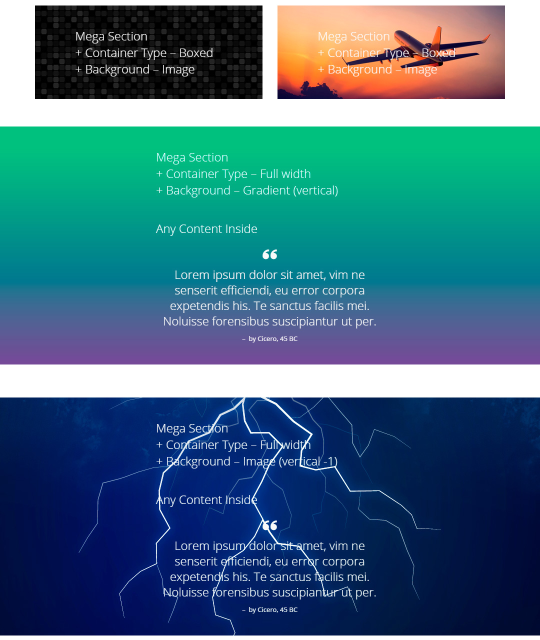
Mega Section Parallax
Container Type
Select primary container type.
Background Style
Select type of the background.
Background Colour (First)
Select background colour. Also this color will be set under background image.
Start of Gradation (Gradient Option)
Select, when the first color starts to changing (from 0 to 100).
Background Colour (Second) (Gradient Option)
Select secondary background colour.
End of Gradation (Gradient Option)
Select, when the first color will be completely replaced by the second color (from 0 to 100).
Gradient Direction (Gradient Option)
Choose direction of gradient.
Background-image (Image Option)
Select file that will be used as background image.
Background-attachment (Image Option)
Option sets whether a background image is fixed or scrolls with the rest content of the page.
Vertical Speed (Image Option)
Select parallax Y-axis speed (vertical). (from -5 to +5)
Horisontal Speed (Image Option)
Select parallax X-axis speed (horisontal). For vertical backgound scroll you may leave this option. (from -5 to +5)
Background-size (Image Option)
Specify the size of the background image.
Background-repeat (Image Option)
Set how a background image will be repeated.
Background-position (Image Option)
Select the starting position of a background image.
Caution!
"Drag and Drop" opportunities for this shortcode is available only in the "FrondEnd Editor" in one of latest versions of "Visual Composer". This shortcode must contain at least one other shortcode inside.
Instruction
In order to create such element - you have to go through the following steps:
- Go to page editing "Dashboard -> Pages -> Edit Page".
- Switch to the "FrontEnd Editor" mode.
- Click to the "Add Element" button.
- Select the "Mega Section".
- Change settings in the new modal window and click "Save changes" and then "Close" (modal window).
- Hover over the "Mega Section" and click "Add Element" (plus icon).
- Now you able to add any content (other shortcodes) inside of this element.
- Do not forget to save changes of the page! Done!
ShortCode:
[mme_mega_section display_type="fullwidth" bg_style="image" bg_color_first="#16a085" bg_gradient_start="0" bg_color_second="#8516a0"bg_gradient_end="100" bg_gradient_direction="vertical" bg_image_src="https://extensions.megamain.com/wp-content/uploads/2015/02/black-mosaic-tiles-1510.png" bg_image_attachment="parallax" bg_image_parallax_v_speed="-1" bg_image_parallax_h_speed="0" bg_image_size="auto" bg_image_repeat="repeat" bg_image_position="center" animation="fadeInUp"] Lorem ipsum dolor... [/mme_mega_section]
Video Section
Container Type
Select primary container type.
Link to the Video
Specify link to the video from the "youtube.com".
Quality
Select the quality of video. Remember that highest quality require more time to load.
Start from
Specifies the time from which the video should start playing.
End at
Specifies the time when the video should stop playing. Set "0" (zero) to unlimit.
Sound
Select, play a sound or not.
Loop
Select whether the video should continuously play or stop playing when video has ended.
Show Controls
Select which control buttons to display.
Background Image
This image will appears instead video for mobile devices. Also it will appear while the video will not load. Warning: To prevent unsolicited downloads over cellular networks at the user’s expense, embedded media cannot be played automatically in mobile browsers.
Caution!
"Drag and Drop" opportunities for this shortcode is available only in the "FrondEnd Editor" in one of latest versions of "Visual Composer". This shortcode must contain at least one other shortcode inside.
Instruction
In order to create such element - you have to go through the following steps:
- Go to page editing "Dashboard -> Pages -> Edit Page".
- Switch to the "FrontEnd Editor" mode.
- Click to the "Add Element" button.
- Select the "Video Section".
- Change settings in the new modal window and click "Save changes" and then "Close" (modal window).
- Hover over the "Vide Section" and click "Add Element" (plus icon).
- Now you able to add any content (other shortcodes) inside of this element.
- Do not forget to save changes of the page! Done!
ShortCode:
[mme_video_section display_type="fullwidth" src="https://www.youtube.com/watch?v=UjFwhxilOdQ" quality="large" start="0" end="0" mute="true" loop="true" controls="mute play_pause" animation="fadeInUp"] Lorem ipsum dolor... [/mme_video_section]

Grid of Posts - Bootstrap Layout
Style
Select the basic style of the post item.
Number of Columns
Select how many posts will be displayed in each row.
Type of Post and Category
Select which the category of posts you want to display.
Limit of Posts Per Page
Select the total number posts you want to display. Other posts will be available by pagination.
Pagination Type
Select a way that will allow the user to see more posts from such category.
Cover Elements of the Image
Select which elements will be displayed, when you hover mouse over the image.
Display Post Meta Information
Which information about the post will be available in the layout.
ShortCode:
[mme_grid_bootstrap layout_single="single_style_1" post_type="post" columns="3" posts_per_page="9" pagination_type="pagination" cover="title icon" post_meta="date,categories" animation="fadeInUp"][/mme_grid_bootstrap]
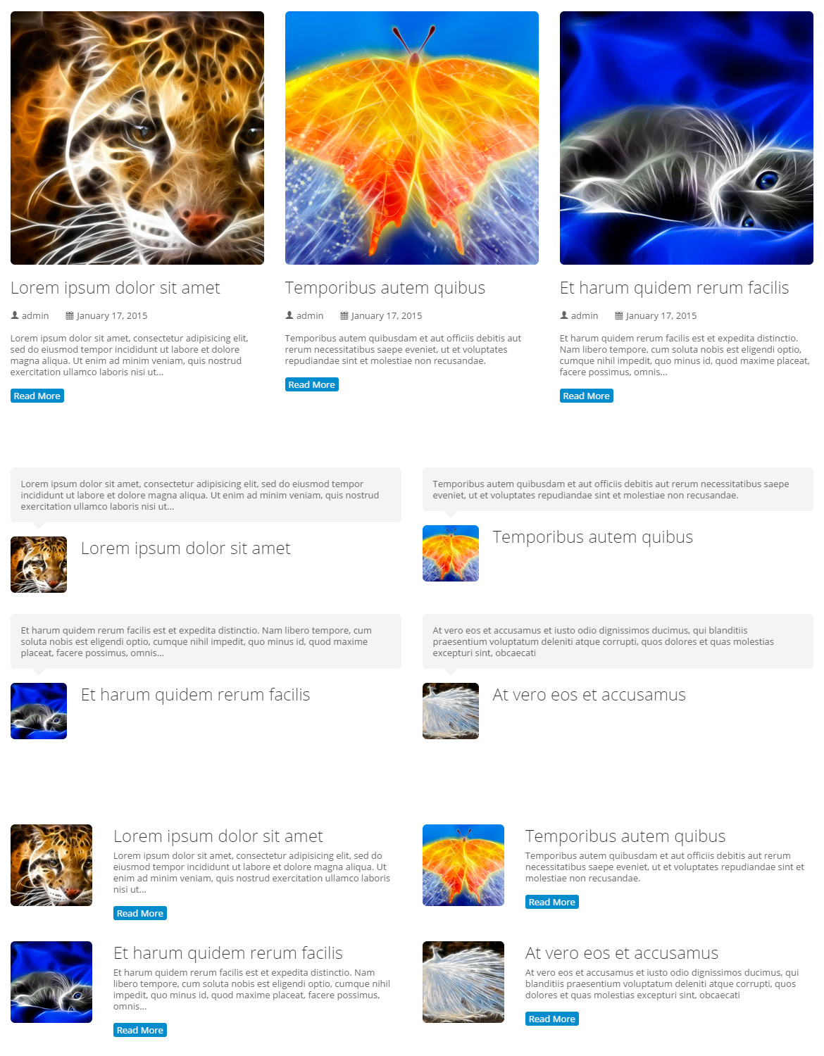
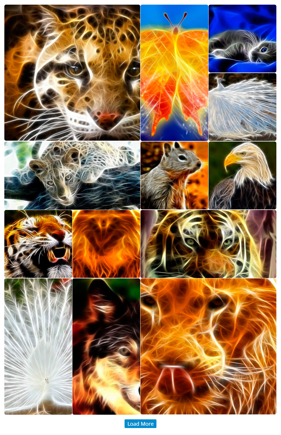
Grid of Posts - Gallery Layout
Type of Post and Category
Select which the category of posts you want to display.
Limit of Posts Per Page
Select the total number posts you want to display. Other posts will be available by pagination.
Pagination Type
Select a way that will allow the user to see more posts from such category.
Cover Elements of the Image
Select which elements will be displayed, when you hover mouse over the image.
ShortCode:
[mme_grid_gallery post_type="post" posts_per_page="9" pagination_type="load_more" cover="title icon" animation="fadeInUp"][/mme_grid_gallery]
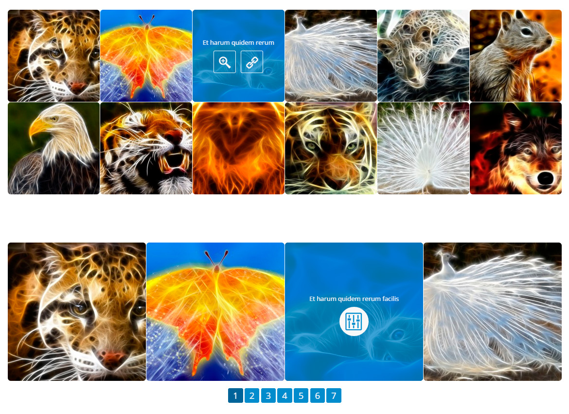
Grid of Posts - Tight Layout
Number of Columns
Select how many posts will be displayed in each row.
Type of Post and Category
Select which the category of posts you want to display.
Limit of Posts Per Page
Select the total number posts you want to display. Other posts will be available by pagination.
Pagination Type
Select a way that will allow the user to see more posts from such category.
Cover Elements of the Image
Select which elements will be displayed, when you hover mouse over the image.
ShortCode:
[mme_grid_tight post_type="post" columns="3" posts_per_page="9" pagination_type="pagination" cover="title icon" animation="fadeInUp"][/mme_grid_tight]
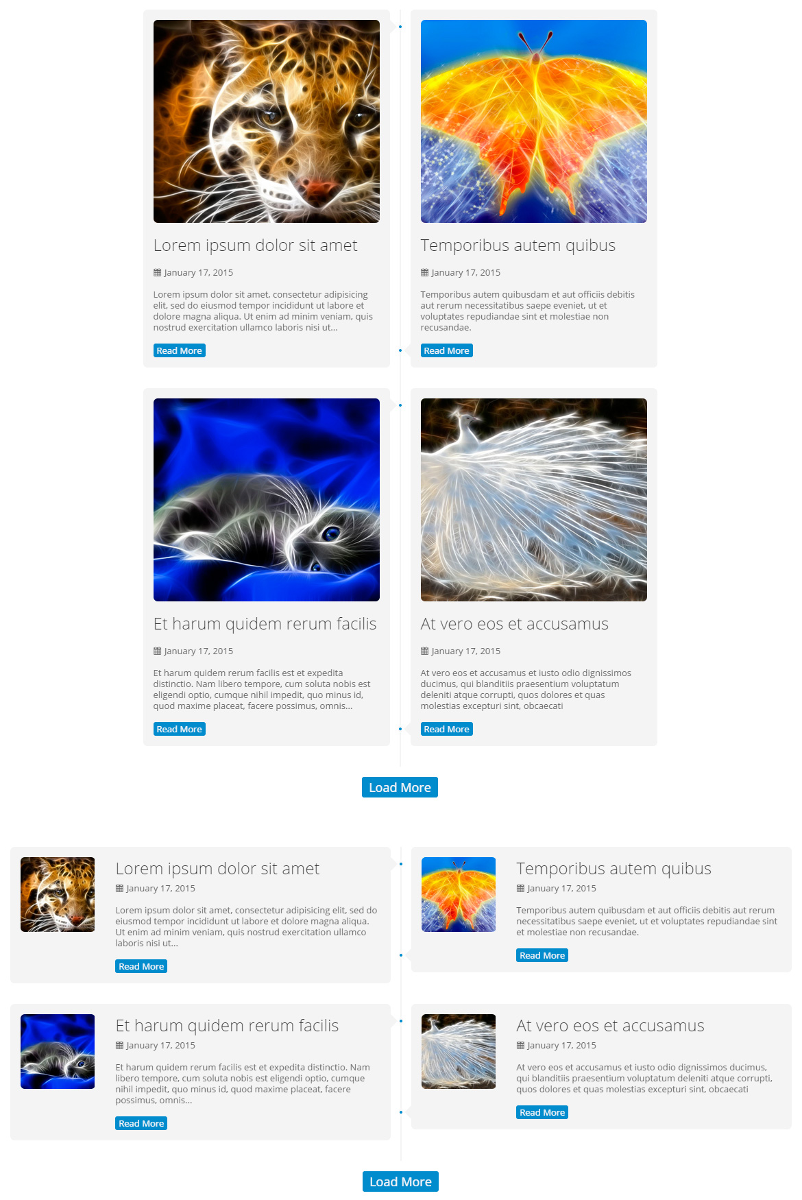
Grid of Posts - Timeline Layout
Style
Select the basic style of the post item.
Number of Columns
Select how many posts will be displayed in each row.
Type of Post and Category
Select which the category of posts you want to display.
Limit of Posts Per Page
Select the total number posts you want to display. Other posts will be available by pagination.
Pagination Type
Select a way that will allow the user to see more posts from such category.
Cover Elements of the Image
Select which elements will be displayed, when you hover mouse over the image.
Display Post Meta Information
Which information about the post will be available in the layout.
ShortCode:
[mme_grid_timeline layout_single="single_style_3" post_type="post" columns="2" posts_per_page="8" pagination_type="load_more" cover="title icon" post_meta="date,categories" animation="fadeInUp"][/mme_grid_timeline]
Area Chart
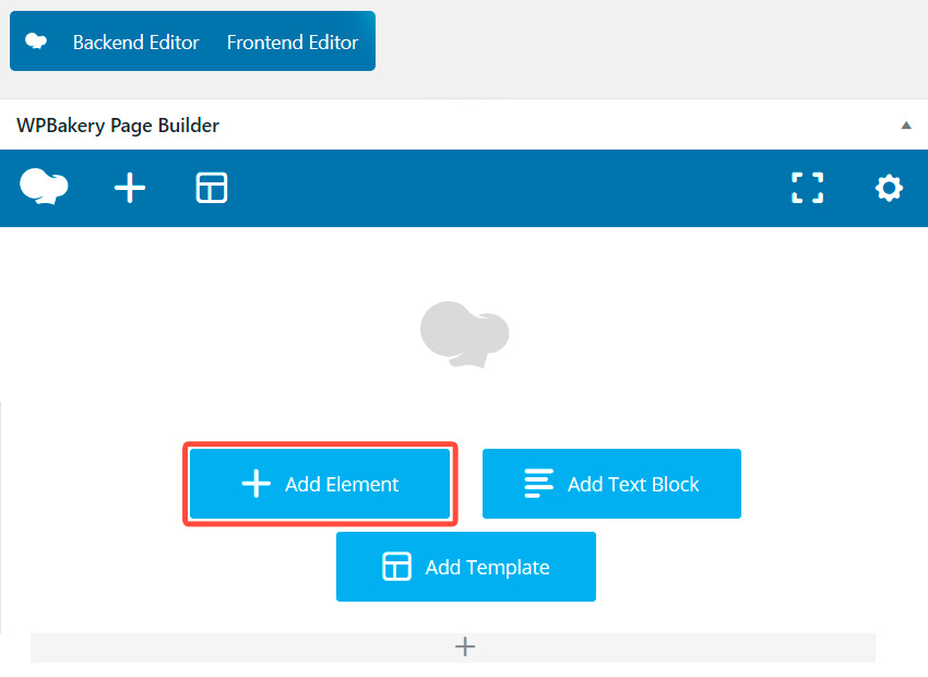
Instruction
In order to create and edit Chart you have to go through the following steps:
- Go to page editing "Dashboard -> Pages -> Edit Page".
- Switch to the "BackEnd Editor" mode.

- Click to the "Add Element" button.
- Select the needed Chart type.
- Now you can edit options for this chat in general and also options for each its index separately. See screenshot. Click button #1 in order to open Chart Options. Click button #2 in order to open Index Options.

- Do not forget to save changes of the page! Done!
Chart Title
Text to display above the chart.
X-axis Labels
Specify labels that will be shown under X-axis (horizontal) line. Allowed any values, text and numeric. Separate values using "verbar" (vertical line) | .
Color Scheme
Select color scheme of this element. You can add more and edit color schemes using "Additional Styles" option on the configuration page of the plugin.
Show Additional Options
Show more options to adjust the chart more accurately.
Format
Select the format of the chart. SVG - interactive format, you can click and highlight inner elements. PNG - have no interactivity, may be open as usual image.
Legend
Display the legend of indexes in the corner of the chart.
Crosshairs
Crosshairs are thin vertical and horizontal lines centered on a data point in a chart. When you, as a chart creator, enable crosshairs in your charts, your users will then be able to target a single element.
Gridlines
Show or hide gridlines inside the chart area.
Maximize Size
Maximizes the area of the chart, and draws the legend and all labels inside the chart area.
Height
Height of the chart, in pixels. Specify "0" (zero) or empty to auto choice.
X-axis Title
Specify a title for the horizontal axis.
Y-axis Title
Specify a title for the vertical axis.
Y-axis Number of Steps
The number of vertical gridlines inside the chart area. Minimum value is 2. Specify -1 to automatically compute the number of gridlines. Specify "0" (zero) or empty to auto choice.
Y-axis min value
Moves the min value of the vertical axis to the specified value. Specify "0" (zero) or empty to auto choice.
Y-axis max value
Moves the max value of the vertical axis to the specified value. Specify "0" (zero) or empty to auto choice.
Caution!
This shortcode must contain at least one "Index of the Chart" (mme_chart_index) shortcode inside.
ShortCode:
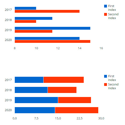
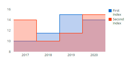
[mme_chart_area_chart title="Worldwide" haxis_labels="2017|2018|2019|2020" styles="default" format="SVG+PNG" legend="true" crosshairs="false" gridlines="false" theme="none" height="" vaxis_steps="0" vaxis_min="0" vaxis_max="0" animation="fadeInUp"] [mme_chart_index title="First Index"]10|11.5|15|14[/mme_chart_index] [mme_chart_index title="Second Index"]14|10|11.5|15[/mme_chart_index][/mme_chart_area_chart]

Bar Chart
Instruction
In order to create and edit Chart you have to go through the following steps:
- Go to page editing "Dashboard -> Pages -> Edit Page".
- Switch to the "BackEnd Editor" mode.
- Click to the "Add Element" button.
- Select the needed Chart type.
- Now you can edit options for this chat in general and also options for each its index separately. See screenshot. Click button #1 in order to open Chart Options. Click button #2 in order to open Index Options.
- Do not forget to save changes of the page! Done!
Chart Title
Text to display above the chart.
X-axis Labels
Specify labels that will be shown under X-axis (horizontal) line. Allowed any values, text and numeric. Separate values using "verbar" (vertical line) | .
Color Scheme
Select color scheme of this element. You can add more and edit color schemes using "Additional Styles" option on the configuration page of the plugin.
Show Additional Options
Show more options to adjust the chart more accurately.
Format
Select the format of the chart. SVG - interactive format, you can click and highlight inner elements. PNG - have no interactivity, may be open as usual image.
Legend
Display the legend of indexes in the corner of the chart.
Thickness of Bars
The width of a group of bars. Specify "0" (zero) or empty to auto choice.
Stack the Bars
Show each index as separated bar, or display them in one line as stack.
Gridlines
Show or hide gridlines inside the chart area.
Maximize Size
Maximizes the area of the chart, and draws the legend and all labels inside the chart area.
Height
Height of the chart, in pixels. Specify "0" (zero) or empty to auto choice.
X-axis Title
Specify a title for the horizontal axis.
Y-axis Title
Specify a title for the vertical axis.
Y-axis Number of Steps
The number of vertical gridlines inside the chart area. Minimum value is 2. Specify -1 to automatically compute the number of gridlines. Specify "0" (zero) or empty to auto choice.
Y-axis min value
Moves the min value of the vertical axis to the specified value. Specify "0" (zero) or empty to auto choice.
Y-axis max value
Moves the max value of the vertical axis to the specified value. Specify "0" (zero) or empty to auto choice.
Caution!
This shortcode must contain at least one "Index of the Chart" (mme_chart_index) shortcode inside.
ShortCode:
[mme_chart_bar_chart title="Worldwide" haxis_labels="2017|2018|2019|2020" styles="default" format="SVG+PNG" legend="true" group_width="0" stacked="false" gridlines="false" theme="none" height="" vaxis_steps="0" vaxis_min="0" vaxis_max="0" animation="fadeInUp"] [mme_chart_index title="First Index"]10|11.5|15|14[/mme_chart_index] [mme_chart_index title="Second Index"]14|10|11.5|15[/mme_chart_index][/mme_chart_bar_chart]
Candlestick Chart
Instruction
In order to create and edit Chart you have to go through the following steps:
- Go to page editing "Dashboard -> Pages -> Edit Page".
- Switch to the "BackEnd Editor" mode.
- Click to the "Add Element" button.
- Select the needed Chart type.
- Now you can edit options for this chat in general and also options for each its index separately. See screenshot. Click button #1 in order to open Chart Options. Click button #2 in order to open Index Options.
- Do not forget to save changes of the page! Done!
Chart Title
Text to display above the chart.
X-axis Labels
Specify labels that will be shown under X-axis (horizontal) line. Allowed any values, text and numeric. Separate values using "verbar" (vertical line) | .
Color Scheme
Select color scheme of this element. You can add more and edit color schemes using "Additional Styles" option on the configuration page of the plugin.
Show Additional Options
Show more options to adjust the chart more accurately.
Format
Select the format of the chart. SVG - interactive format, you can click and highlight inner elements. PNG - have no interactivity, may be open as usual image.
Legend
Display the legend of indexes in the corner of the chart.
Thickness of Bars
The width of a group of bars. Specify "0" (zero) or empty to auto choice.
Gridlines
Show or hide gridlines inside the chart area.
Maximize Size
Maximizes the area of the chart, and draws the legend and all labels inside the chart area.
Height
Height of the chart, in pixels. Specify "0" (zero) or empty to auto choice.
X-axis Title
Specify a title for the horizontal axis.
Y-axis Title
Specify a title for the vertical axis.
Y-axis Number of Steps
The number of vertical gridlines inside the chart area. Minimum value is 2. Specify -1 to automatically compute the number of gridlines. Specify "0" (zero) or empty to auto choice.
Y-axis min value
Moves the min value of the vertical axis to the specified value. Specify "0" (zero) or empty to auto choice.
Y-axis max value
Moves the max value of the vertical axis to the specified value. Specify "0" (zero) or empty to auto choice.
Caution!
This shortcode must contain at least one "Index of the Chart" (mme_chart_index) shortcode inside.
ShortCode:
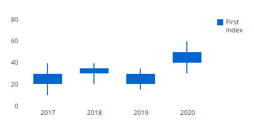
[mme_chart_candlestick_chart title="Worldwide" haxis_labels="2017|2018|2019|2020" styles="default" format="SVG+PNG" legend="true" group_width="0" gridlines="false" theme="none" height="" vaxis_steps="0" vaxis_min="0" vaxis_max="0" animation="fadeInUp"] [mme_chart_index title="First Index"]10|20|15|30[/mme_chart_index] [mme_chart_index title="Second Index"]20|30|20|40[/mme_chart_index] [mme_chart_index title="Third Index"]30|35|30|50[/mme_chart_index] [mme_chart_index title="Fourth Index"]40|40|35|60[/mme_chart_index][/mme_chart_candlestick_chart]
Column Chart
Instruction
In order to create and edit Chart you have to go through the following steps:
- Go to page editing "Dashboard -> Pages -> Edit Page".
- Switch to the "BackEnd Editor" mode.
- Click to the "Add Element" button.
- Select the needed Chart type.
- Now you can edit options for this chat in general and also options for each its index separately. See screenshot. Click button #1 in order to open Chart Options. Click button #2 in order to open Index Options.
- Do not forget to save changes of the page! Done!
Chart Title
Text to display above the chart.
X-axis Labels
Specify labels that will be shown under X-axis (horizontal) line. Allowed any values, text and numeric. Separate values using "verbar" (vertical line) | .
Color Scheme
Select color scheme of this element. You can add more and edit color schemes using "Additional Styles" option on the configuration page of the plugin.
Show Additional Options
Show more options to adjust the chart more accurately.
Format
Select the format of the chart. SVG - interactive format, you can click and highlight inner elements. PNG - have no interactivity, may be open as usual image.
Legend
Display the legend of indexes in the corner of the chart.
Thickness of Bars
The width of a group of bars. Specify "0" (zero) or empty to auto choice.
Stack the Bars
Show each index as separated bar, or display them in one line as stack.
Gridlines
Show or hide gridlines inside the chart area.
Maximize Size
Maximizes the area of the chart, and draws the legend and all labels inside the chart area.
Height
Height of the chart, in pixels. Specify "0" (zero) or empty to auto choice.
X-axis Title
Specify a title for the horizontal axis.
Y-axis Title
Specify a title for the vertical axis.
Y-axis Number of Steps
The number of vertical gridlines inside the chart area. Minimum value is 2. Specify -1 to automatically compute the number of gridlines. Specify "0" (zero) or empty to auto choice.
Y-axis min value
Moves the min value of the vertical axis to the specified value. Specify "0" (zero) or empty to auto choice.
Y-axis max value
Moves the max value of the vertical axis to the specified value. Specify "0" (zero) or empty to auto choice.
Caution!
This shortcode must contain at least one "Index of the Chart" (mme_chart_index) shortcode inside.
ShortCode:
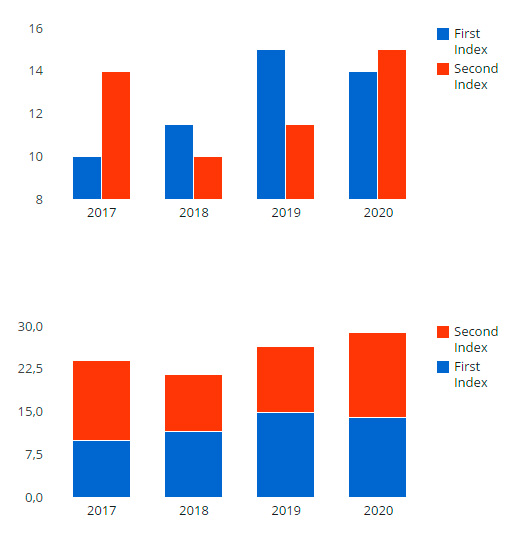
[mme_chart_column_chart title="Worldwide" haxis_labels="2017|2018|2019|2020" styles="default" format="SVG+PNG" legend="true" group_width="0" stacked="false" gridlines="false" theme="none" height="" vaxis_steps="0" vaxis_min="0" vaxis_max="0" animation="fadeInUp"] [mme_chart_index title="First Index"]10|11.5|15|14[/mme_chart_index] [mme_chart_index title="Second Index"]14|10|11.5|15[/mme_chart_index][/mme_chart_column_chart]
Histogram
Instruction
In order to create and edit Chart you have to go through the following steps:
- Go to page editing "Dashboard -> Pages -> Edit Page".
- Switch to the "BackEnd Editor" mode.
- Click to the "Add Element" button.
- Select the needed Chart type.
- Now you can edit options for this chat in general and also options for each its index separately. See screenshot. Click button #1 in order to open Chart Options. Click button #2 in order to open Index Options.
- Do not forget to save changes of the page! Done!
Chart Title
Text to display above the chart.
X-axis Labels
Specify labels that will be shown under X-axis (horizontal) line. Allowed any values, text and numeric. Separate values using "verbar" (vertical line) | .
Color Scheme
Select color scheme of this element. You can add more and edit color schemes using "Additional Styles" option on the configuration page of the plugin.
Show Additional Options
Show more options to adjust the chart more accurately.
Format
Select the format of the chart. SVG - interactive format, you can click and highlight inner elements. PNG - have no interactivity, may be open as usual image.
Legend
Display the legend of indexes in the corner of the chart.
Thickness of Bars
The width of a group of bars. Specify "0" (zero) or empty to auto choice.
Stack the Bars
Show each index as separated bar, or display them in one line as stack.
Gridlines
Show or hide gridlines inside the chart area.
Maximize Size
Maximizes the area of the chart, and draws the legend and all labels inside the chart area.
Height
Height of the chart, in pixels. Specify "0" (zero) or empty to auto choice.
X-axis Title
Specify a title for the horizontal axis.
Y-axis Title
Specify a title for the vertical axis.
Y-axis Number of Steps
The number of vertical gridlines inside the chart area. Minimum value is 2. Specify -1 to automatically compute the number of gridlines. Specify "0" (zero) or empty to auto choice.
Y-axis min value
Moves the min value of the vertical axis to the specified value. Specify "0" (zero) or empty to auto choice.
Y-axis max value
Moves the max value of the vertical axis to the specified value. Specify "0" (zero) or empty to auto choice.
Caution!
This shortcode must contain at least one "Index of the Chart" (mme_chart_index) shortcode inside.
ShortCode:
[mme_chart_histogram title="Worldwide" haxis_labels="2017|2018|2019|2020" styles="default" format="SVG+PNG" legend="true" group_width="0" stacked="false" gridlines="false" theme="none" height="" vaxis_steps="0" vaxis_min="0" vaxis_max="0" animation="fadeInUp"] [mme_chart_index title="Quarks"]1|1|2|3|5|8|13[/mme_chart_index] [mme_chart_index title="Leptons"]1|2|3|5|8|13|21[/mme_chart_index] [mme_chart_index title="Gauge Bosons"]2|3|5|8|13|21|34[/mme_chart_index] [mme_chart_index title="Scalar Bosons"]3[/mme_chart_index][/mme_chart_histogram]

Line Chart
Instruction
In order to create and edit Chart you have to go through the following steps:
- Go to page editing "Dashboard -> Pages -> Edit Page".
- Switch to the "BackEnd Editor" mode.
- Click to the "Add Element" button.
- Select the needed Chart type.
- Now you can edit options for this chat in general and also options for each its index separately. See screenshot. Click button #1 in order to open Chart Options. Click button #2 in order to open Index Options.
- Do not forget to save changes of the page! Done!
Chart Title
Text to display above the chart.
X-axis Labels
Specify labels that will be shown under X-axis (horizontal) line. Allowed any values, text and numeric. Separate values using "verbar" (vertical line) | .
Color Scheme
Select color scheme of this element. You can add more and edit color schemes using "Additional Styles" option on the configuration page of the plugin.
Show Additional Options
Show more options to adjust the chart more accurately.
Format
Select the format of the chart. SVG - interactive format, you can click and highlight inner elements. PNG - have no interactivity, may be open as usual image.
Legend
Display the legend of indexes in the corner of the chart.
Crosshairs
Crosshairs are thin vertical and horizontal lines centered on a data point in a chart. When you, as a chart creator, enable crosshairs in your charts, your users will then be able to target a single element.
Curves Type
You can smooth the lines.
Gridlines
Show or hide gridlines inside the chart area.
Maximize Size
Maximizes the area of the chart, and draws the legend and all labels inside the chart area.
Height
Height of the chart, in pixels. Specify "0" (zero) or empty to auto choice.
X-axis Title
Specify a title for the horizontal axis.
Y-axis Title
Specify a title for the vertical axis.
Y-axis Number of Steps
The number of vertical gridlines inside the chart area. Minimum value is 2. Specify -1 to automatically compute the number of gridlines. Specify "0" (zero) or empty to auto choice.
Y-axis min value
Moves the min value of the vertical axis to the specified value. Specify "0" (zero) or empty to auto choice.
Y-axis max value
Moves the max value of the vertical axis to the specified value. Specify "0" (zero) or empty to auto choice.
Caution!
This shortcode must contain at least one "Index of the Chart" (mme_chart_index) shortcode inside.
ShortCode:
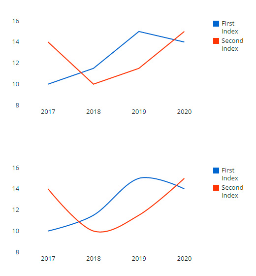
[mme_chart_line_chart title="Worldwide" haxis_labels="2017|2018|2019|2020" styles="default" format="SVG+PNG" legend="true" crosshairs="false" curves_type="function" gridlines="false" theme="none" height="" vaxis_steps="0" vaxis_min="0" vaxis_max="0" animation="fadeInUp"] [mme_chart_index title="First Index"]10|11.5|15|14[/mme_chart_index] [mme_chart_index title="Second Index"]14|10|11.5|15[/mme_chart_index][/mme_chart_line_chart]
Pie Chart
Instruction
In order to create and edit Chart you have to go through the following steps:
- Go to page editing "Dashboard -> Pages -> Edit Page".
- Switch to the "BackEnd Editor" mode.
- Click to the "Add Element" button.
- Select the needed Chart type.
- Now you can edit options for this chat in general and also options for each its index separately. See screenshot. Click button #1 in order to open Chart Options. Click button #2 in order to open Index Options.
- Do not forget to save changes of the page! Done!
Chart Title
Text to display above the chart.
Labels
Specify labels that will be shown under X-axis (horizontal) line. Allowed any values, text and numeric. Separate values using "verbar" (vertical line) | .
Color Scheme
Select color scheme of this element. You can add more and edit color schemes using "Additional Styles" option on the configuration page of the plugin.
Show Additional Options
Show more options to adjust the chart more accurately.
Format
Select the format of the chart. SVG - interactive format, you can click and highlight inner elements. PNG - have no interactivity, may be open as usual image.
Legend
Display the legend of indexes in the corner of the chart.
Dimension
Choose dimension to display chart.
- 2D
- 3D
Text in Slices
The content of the text displayed on the slice.
- percentage
- value
- label
- none
Size of Hole
Size of hole in the center of chart. In the percents. "0" (zero) means no hole.
Highlight Slice
You can slightly move one of slices to highlight it. "0" (zero) means no one slice is highlighted.
Maximize Size
Maximizes the area of the chart, and draws the legend and all labels inside the chart area.
Height
Height of the chart, in pixels. Specify "0" (zero) or empty to auto choice.
X-axis Title
Specify a title for the horizontal axis.
Y-axis Title
Specify a title for the vertical axis.
Y-axis Number of Steps
The number of vertical gridlines inside the chart area. Minimum value is 2. Specify -1 to automatically compute the number of gridlines. Specify "0" (zero) or empty to auto choice.
Y-axis min value
Moves the min value of the vertical axis to the specified value. Specify "0" (zero) or empty to auto choice.
Y-axis max value
Moves the max value of the vertical axis to the specified value. Specify "0" (zero) or empty to auto choice.
Caution!
This shortcode must contain only one "Index of the Chart" (mme_chart_index) shortcode inside.
ShortCode:
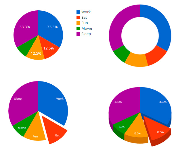
[mme_chart_pie_chart title="Worldwide" styles="default" format="SVG+PNG" legend="true" dimension="2D" slice_text="percentage" hole_size="0" highlight_slice="0" theme="none" height="" animation="fadeInUp"] [mme_chart_index title="Work"]8[/mme_chart_index] [mme_chart_index title="Eat"]3[/mme_chart_index] [mme_chart_index title="Fun"]3[/mme_chart_index] [mme_chart_index title="Movie"]2[/mme_chart_index] [mme_chart_index title="Sleep"]8[/mme_chart_index][/mme_chart_pie_chart]
Stepped Area Chart
Instruction
In order to create and edit Chart you have to go through the following steps:
- Go to page editing "Dashboard -> Pages -> Edit Page".
- Switch to the "BackEnd Editor" mode.
- Click to the "Add Element" button.
- Select the needed Chart type.
- Now you can edit options for this chat in general and also options for each its index separately. See screenshot. Click button #1 in order to open Chart Options. Click button #2 in order to open Index Options.
- Do not forget to save changes of the page! Done!
Chart Title
Text to display above the chart.
X-axis Labels
Specify labels that will be shown under X-axis (horizontal) line. Allowed any values, text and numeric. Separate values using "verbar" (vertical line) | .
Color Scheme
Select color scheme of this element. You can add more and edit color schemes using "Additional Styles" option on the configuration page of the plugin.
Show Additional Options
Show more options to adjust the chart more accurately.
Format
Select the format of the chart. SVG - interactive format, you can click and highlight inner elements. PNG - have no interactivity, may be open as usual image.
Legend
Display the legend of indexes in the corner of the chart.
Connect Steps
If set to "Enable", will connect the steps to form a stepped line. Otherwise, only a top line appears.
Stack the Bars
Show each index as separated bar, or display them in one line as stack.
Gridlines
Show or hide gridlines inside the chart area.
Maximize Size
Maximizes the area of the chart, and draws the legend and all labels inside the chart area.
Height
Height of the chart, in pixels. Specify "0" (zero) or empty to auto choice.
X-axis Title
Specify a title for the horizontal axis.
Y-axis Title
Specify a title for the vertical axis.
Y-axis Number of Steps
The number of vertical gridlines inside the chart area. Minimum value is 2. Specify -1 to automatically compute the number of gridlines. Specify "0" (zero) or empty to auto choice.
Y-axis min value
Moves the min value of the vertical axis to the specified value. Specify "0" (zero) or empty to auto choice.
Y-axis max value
Moves the max value of the vertical axis to the specified value. Specify "0" (zero) or empty to auto choice.
Caution!
This shortcode must contain at least one "Index of the Chart" (mme_chart_index) shortcode inside.
ShortCode:
[mme_chart_stepped_area_chart title="Worldwide" haxis_labels="2017|2018|2019|2020" styles="default" format="SVG+PNG" legend="true" group_width="0" stacked="false" gridlines="false" theme="none" height="" vaxis_steps="0" vaxis_min="0" vaxis_max="0" animation="fadeInUp"] [mme_chart_index title="First Index"]10|11.5|15|14[/mme_chart_index] [mme_chart_index title="Second Index"]14|10|11.5|15[/mme_chart_index][/mme_chart_stepped_area_chart]
Interactive Map
Instruction
In order to create and edit Chart you have to go through the following steps:
- Go to page editing "Dashboard -> Pages -> Edit Page".
- Switch to the "BackEnd Editor" mode.
- Click to the "Add Element" button.
- Select the needed Chart type.
- Now you can edit options for this chat in general and also options for each its index separately. See screenshot. Click button #1 in order to open Chart Options. Click button #2 in order to open Index Options.
- Do not forget to save changes of the page! Done!
Chart Title
Text to display above the chart.
Region to Display
You can specify the region using your native language. Or use code by international standards - ISO 3166-2. Examples: New Yourk, NY.
Display Mode
Which type of geochart this is.
- auto
- regions
- markers
- text
Show Additional Options
Show more options to adjust the chart more accurately.
Format
Select the format of the chart. SVG - interactive format, you can click and highlight inner elements. PNG - have no interactivity, may be open as ordinary image.
Dataless Region Color
Color to assign to regions with no associated data.
Interactive Region Color
This color will assigned to interactive regions by default.
Height
Height of the chart, in pixels. Specify "0" (zero) or empty to auto choice.
Caution!
This shortcode must contain at least one "Index of the Geo Chart" (mme_chart_geo_index) shortcode inside.
ShortCode:
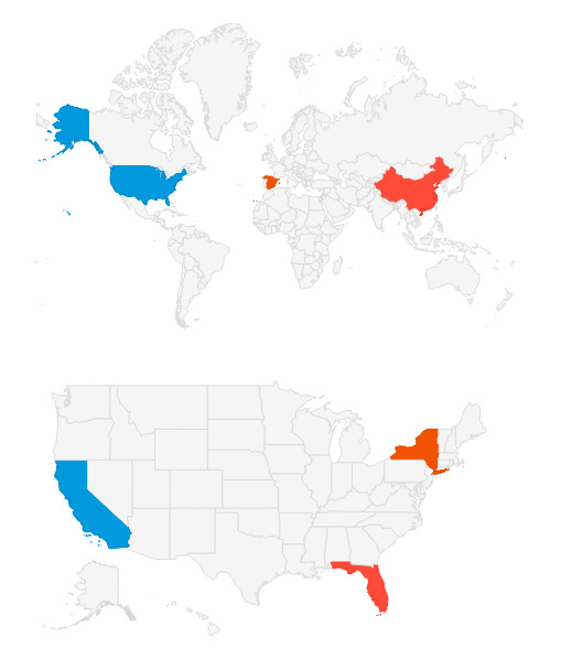
[mme_chart_geo_chart title="World" region="world" display_mode="auto" format="SVG+PNG" dataless_region_color="" interactive_region_color="" height="" animation="fadeInUp"] [mme_chart_geo_index region="US" color="#3498DB" title="USA" link="/"] This text will be shown when you hover on the region [/mme_chart_geo_index] [mme_chart_geo_index region="CN" color="#E74C3C" title="中国" link="/"] 当你在徘徊区域本文将显示 [/mme_chart_geo_index] [mme_chart_geo_index region="ES" color="#D35400" title="España" link="/"] Este texto se muestra cuando se pasa sobre la región [/mme_chart_geo_index][/mme_chart_geo_chart]
Address Map
Show Additional Options
Show more options to adjust the chart more accurately.
Map Type
The type of map to show.
- normal
- hybrid
- terrain
- satellite
Map Type Controls
Show a map type selector that enables the viewer to switch between [normal, satellite, hybrid, terrain].
Zoom Level
An integer indicating the initial zoom level of the map, where 0 is completely zoomed out (whole world) and 19 is the maximum zoom level. Leave blank to auto zoom.
Height
Height of the chart, in pixels. Specify "0" (zero) or empty to auto choice.
Caution!
This shortcode must contain at least one "Marker on the Map" (mme_map_location) shortcode inside.
ShortCode:
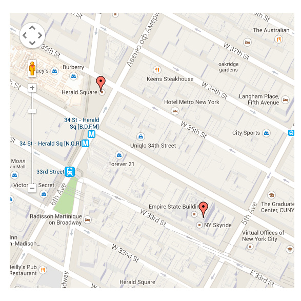
[mme_map map_type="normal" map_type_controls="false" zoom="0" height="" animation="fadeInUp"] [mme_map_location address="350 5th Ave, New York, United States"] Empire State Building [/mme_map_location] [mme_map_location address="Herald Square, New York, United States"] Herald Square [/mme_map_location][/mme_map]
Index of the Chart
Caution!
This is a "child" shortcode. It has no own appearance. It can be used only inside one of "Charts" (mme_chart_area_chart) shortcodes.
Index Name
Text to display as name of this index.
Values
Specify values that will be shown an chart. Allowed only numeric values (integers, floating point numbers). Separate values using "verbar" (vertical line) | .
ShortCode:
[mme_chart_index title="First Index"]10|11.5|15|14[/mme_chart_index]
Index of the Geo Chart
Caution!
This is a "child" shortcode. It has no own appearance. It can be used only inside "Interactive Map" (mme_chart_geo_chart) shortcode.
Region Name (Code)
You can specify the region using your native language. Or use code by international standards - ISO 3166-2. Examples: New Yourk, NY.
Title (tooltip)
Title that will appear in the tooltip.
Content (tooltip)
Text that will appear in the tooltip.
Color
Select custom color for this region. Leave blank to use the default color.
Link
The user goes to this link if he clicks on this region.
ShortCode:
[mme_chart_geo_index region="US" color="#3498DB" title="USA" link="/"]This text will be shown when you hover on the region[/mme_chart_geo_index]
Location (marker) on the Map
Caution!
This is a "child" shortcode. It has no own appearance. It can be used only inside "Address Map" (mme_map) shortcode.
Address (Region)
You can specify the region using your native language.
Content (tooltip)
Text that will appear in the tooltip.
Custom Marker
You can select any raster image to use it as marker for this address.
ShortCode:
[mme_map_locationaddress="350 5th Ave, New York, United States" marker="https://megamain.com/src/img/megamain-logo-120x120.png"]Empire State Building[/mme_map_location]
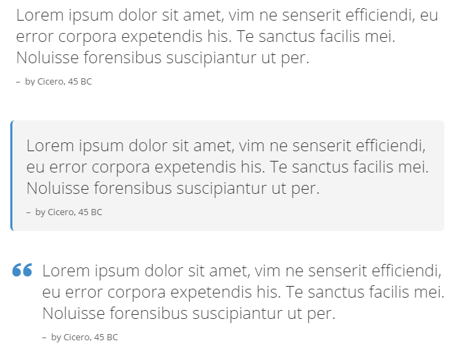
Blockquote
Style
Select the basic style of the element.
Text of the Quote
Enter the text of the quote.
Name of the Author (Source)
Enter the Name of the author (Source).
Link to the Author (Source)
Enter the link to the author (Source).
Alignment
Specifies the horizontal alignment of element and it content.
Color Scheme
Select color scheme of this element. You can add more and edit color schemes using "Additional Styles" option on the configuration page of the plugin.
ShortCode:
[mme_blockquote class="1" author_name="by Cicero, 45 BC" link="https://megamain.com/" alignment="left" styles="predefined" animation="fadeInUp"]Lorem ipsum dolor...[/mme_blockquote]
Circle Tabs
Tabs Size
Size of icons that serve as buttons.
Style
Select the basic style of the element.
Position of first tab (optional)
You can choose the angle of the circle where you want to show first tab. All other tabs will be distributed according to their number. Example: 90 - the first tab on right side; 180 - the first tab at bottom. min = 0, max = 360.
Animation Effect
Select animation effect of changing of tabs.
Animation Direction
Select direction of animation.
Slideshow
Select "Enable" to change tabs automatically.
Slideshow Speed
Specify the delay between changing of tabs.
Color Scheme
Select color scheme of this element. You can add more and edit color schemes using "Additional Styles" option on the configuration page of the plugin.
Caution!
This shortcode must contain at least one "Slide" (mme_slide) shortcode inside.
ShortCode:
[mme_circle_tabs tabs_size="40" class="1" rotate="0" animation_effect="slide" animation_direction="horizontal" slideshow="true" slideshow_speed="7000" color_scheme="default" animation="fadeInUp"] [mme_slide title="First Tab"] Lorem ipsum dolor sit amet... [/mme_slide] [mme_slide title="Second Tab"] Usu id amet congue sadipscing... [/mme_slide][/mme_circle_tabs]
Codeblock
Type of data storage
"Base64" encoding help you to maintain the structure of your code (spaces, tabs and etc.).
Content
Just insert your code here.
Color Scheme
Select color scheme of this element.
Convert characters to HTML entities
Convert all applicable characters to HTML entities.
ShortCode:
[mme_codeblock type_of_data="default" htmlentities="htmlentities" animation="fadeInUp"]Lorem ipsum dolor...[/mme_codeblock]
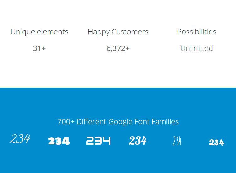
Counter
Start from
Select initial number, that will be shown first.
Final Value
Select final number, that will be shown at the end of count.
Duration
Duration of animation in the seconds.
Thousands Separator (optional)
It can be comma, point, space, or any other symbol.
Prefix (optional)
Any text or sign that will be before number. Example: $.
Suffix (optional)
Any text or sign that will be after number. Example: mph.
Font Size
Size of the font.
Font Family
You can add more fonts using the "Set Of Installed Google Fonts" option on the configuration page of the plugin.
Font Color (optional)
Select color of the font for this element.
Link to (optional)
You can use this element as a link to some page.
Content at the end of count (optional)
This content will replace the counter at the end of count. Leave blank in order to not replace counter.
Alignment
Specifies the horizontal alignment of element and it content.
ShortCode:
[mme_counter start="1" stop="2712" duration="3" separator="," prefix="$" suffix="+" size="24" font_family="Inherit" font_color="#000000" link="#" alignment="center" animation="fadeInDown" extra_css_class="extra_css_class"]Content At The End Of Count (Optional)[/mme_counter]
Divider
Style
Select the basic style of the element.
Size of the Vertical Space
Select how many space you need between two elements.
Color Scheme
Select color scheme of this element. You can add more and edit color schemes using "Additional Styles" option on the configuration page of the plugin.
ShortCode:
[mme_divider class="style_2" size="24" animation="fadeInUp"] [/mme_divider]

Header
Text
Enter the text of the header.
Size
Select font size of the header.
Font Family
You can add more fonts using the "Plugin Configuration Page".
Link to
You can use this element as a link to some page.
Alignment
Specifies the horizontal alignment of element and it content.
Color Scheme
Select color scheme of this element. You can add more and edit color schemes using "Additional Styles" option on the configuration page of the plugin.
ShortCode:
[mme_header size="24" font_family="Inherit" alignment="center" animation="fadeInUp"]Lorem ipsum dolor...[/mme_header]
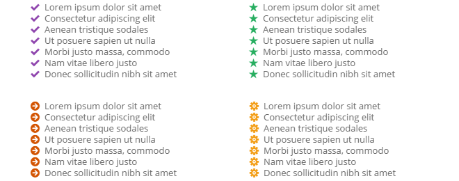
List With Icons
List
Add your list here. You can separate the list items using new line.
Icon (marker)
You can add more custom raster icons using the "Plugin Configuration Page"
Icon Size
Select the icon size.
Icon Color
Select the icon color.
Alignment
Specifies the horizontal alignment of element and it content.
ShortCode:
[mme_list_with_icons icon="im-icon-checkmark" icon_size="12" icon_color="#3079ed" animation="fadeInUp"]Lorem ipsum dolor...[/mme_list_with_icons]
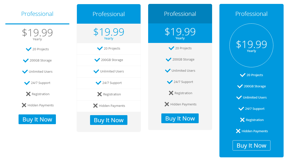
Pricing Table
Header (optional)
Name of this commercial offer.
Price (optional)
Price of this commercial offer. Example: $9.99.
Period (optional)
Additional text below the price. Example: Yearly, Monthly, Weekly, Hourly.
Image (optional)
You can add the image of good or service.
List of Advantages (optional)
List of advantage of this commercial offer. Separate each list item by new line or vertical bar (|). Put a plus symbol (+) at the beginning of the line and plus will be replaced by a checkmark (✓) which means that the advantage is included in this offer. Put a minus symbol (-) at the beginning of the line and minus will be replaced by a cross (✕) which means that the advantage is excluded from this offer.
Text of Button (optional)
Enter the text of button. Leave blank to hide.
Link to (optional)
If no text buttons, but there is a link address then the entire table will be the link.
Recommended Deal
Highlight this table.
Style
Select the basic style of the element.
Alignment
Specifies the horizontal alignment of element and it content.
Color Scheme
Select color scheme of this element. You can add more and edit color schemes using "Additional Styles" option on the configuration page of the plugin.
ShortCode:
[mme_pricing_table heading="Professional" price="$19.99" period="per month" image="/wp-content/uploads/megamain-logo-120x120.png" button_text="Sign Up Now" link="#link" recommended="disable" class="1" alignment="center" color_scheme="default" infinite="infinite" extra_css_class="extra_css_class"]+10 Projects +100GB Storage +Unlimited Users +24/7 Support -Registration -Hidden Payments[/mme_pricing_table]
Summary
Summary Text (optional)
Text that will be displayed as summary. Other shortcodes allowed.
Direction
Specifies the alignment of element. Position of Summary element.
Style
Select the basic style of the element.
Color Scheme
Select color scheme of this element. You can add more and edit color schemes using "Additional Styles" option on the configuration page of the plugin.
Caution!
This is "Container Shortcode" which means that you can place other shortcodes inside this one as its content.
ShortCode:
[mme_summary text="Summary Text" direction="right" class="1" color_scheme="default" animation="fadeInDown" infinite="infinite" extra_css_class="extra_css_class"]+10 Projects, +100GB Storage, +Unlimited Users, +24/7 Support[/mme_summary]
Update
Follow the next steps to update (reinstall) plugin, all these steps are important for the correct working of the plugin:
- Deactivate and remove the old version (all settings will be saved);
- Install the new version;
- Go to the "Plugin Configuration" page and save settings again (*important);
- Clear cache of the your browser;
- All done.
Support
If you need support, if you have a question or suggestion - leave a message on our support page Support.MegaMain.com.